

Things I know to be true about paper crafting:
a) It's more difficult than it looks.
Especially if one has taken a year or so off from it. (Hypothetically, of course.)
Seriously... props, paper crafters. I have a whole new appreciation for this form of art. In my experience, I would not say that coming back to paper crafting has been like riding a bike. At all.
b) It's more gratifying than it looks.
Right?
Seeing a vision come to fruition... man... I love that feeling.
And being blown away by someone else's vision... also gratifying.
c) It's more about the people than the crafts.
And today... it's about the people of Paper Crafts & Scrapbooking Magazine.

(Go-to-Gals, but missing Kim Hughes! Still love you, Kim!)
I submitted by first few cards for the Stamping Royalty contest of...
oh, man...
2006.
Yup, they had it all the way back then ;)
In a stroke of luck, both cards were picked.
And so it began for me.
I ended up at my first CHA with the long-gone-by-the-wayside Paper Salon team (if you remember Paper Salon, God bless you, because you've been around a while) and met then editor-in-chief Stacy Croninger, and then editors Megan Hoeppner, P Kelly Smith, Cath Edvalson, and Brandy Jesperson.

I'm sure my story is similar to many of yours...
they were so encouraging.
They made me feel like they were excited to have me.
They made me feel like I had something new to contribute to the magazine.
What more does any creative person want than to be able to express themselves creatively and feel valued in return? It's our own kind of heaven.

(Kelly, Susan, me, Anabelle O'Malley, and Cindy Smith of Emma's Paperie)
Over the years some editors rearranged and relationships grew to include Jennifer Minerman Shaerer (who can practically read you like a book after asking your birthday, place of birth, etc, and handing you a personalized astrology analysis) and Susan Opel (of colored hanger fame but also my Bay City buddy) and as time went on, an eventual post as a Go-to-Gal.
I saved the answering machine message from Jennifer offering me a spot (yeah... ACTUAL answering machine. Not a voice mail. ANSWERING MACHINE. Continue on with the story.) and played it for my mom to tell her.
Can it be noted here that any time any one is sweet and encouraging to your own personal mother that they are going to build up within you a well of gratitude wide enough to fill an ocean? That was the entire editorial team to my mom :)
Sidenote... it was only a few weeks after taking on the Go-to-Gal gig that we got the call about Noelle (excuse the formatting on that post, please; my older posts have been reformatted so that there are no breaks. Not intentional, I swear.) so I went from mom of 2 to mom of 2 plus a newborn alongside this new gig in a matter of days. Cath was one of the very first people in my life to know we had adopted a daughter in just a few days time because I was in the middle of an assignment for her. Only time I asked for more time on a card :) Thanks, Cath.
I've heard it echoed among many of the other Go-to-Gals say that this call was a dream come true and I'm no different. But man, getting to have that gig alongside those girls... Teri, Kim H, Maren, Betsy, and Kim K... and alongside those editors... seriously humbling.
And seriously hilarious.
Infamous example A:

Infamous example B:

And so I offer my small token of thanks that could never match the depth of gratitude for the people of Paper Crafts & Scrapbooking that lives in my heart.

Thanks for your encouragement.
Thanks for your validation.
Thanks for your commitment to us... your contributors and fans of PC&S.
Thanks for your sympathy tears when I needed them.
Thanks for your hugs.
Thanks for your laughter.
Thanks for your friendship.

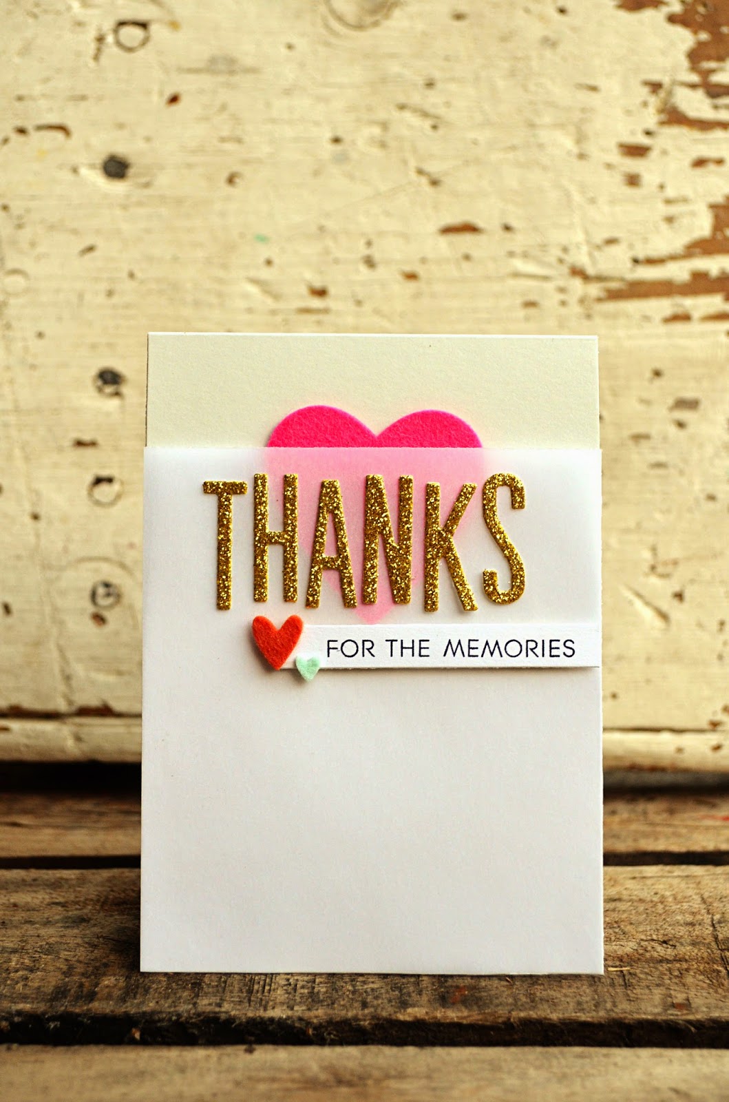
Thanks for the memories, friends.
My prayer for you is that as you move on you go with the knowledge that you and your work were and are valued and appreciated by me and so many others. Blessings to you.
Today's hop started over with Jennifer McGuire,
led you here from Rae Barthel,
and continues on next with Annette Witherspoon.
I've enjoyed dipping my toes back in today, folks.
Thanks for having me :)

{Thanks} card
CS - Soft Stone, White, Vellum (Papertrey Ink)
Glitter CS - American Crafts
Ink - True Black (PTI)
Stamps - Thanks All Ways (PTI)
Dies - Headline Alpha, Heart Prints, Love Lives Here (PTI)
Felt - Raspberry Fizz, Aqua Mist, Canyon Clay (PTI)